The prison visits booking team had a problem: we were getting excessive amounts of feedback to our technical helpdesk that we couldn’t address.
Users of the service, which allows friends and relatives to book a slot to visit someone in prison, were writing in with irrelevant questions like, “I haven’t heard back from the prison about my visit, when will I hear?” and “Can I change my visit?”.
These were all misdirected queries which should have been sent directly to the prison where they were booking the visit. As a result our contact centre staff were spending hours redirecting these queries to the relevant prison.
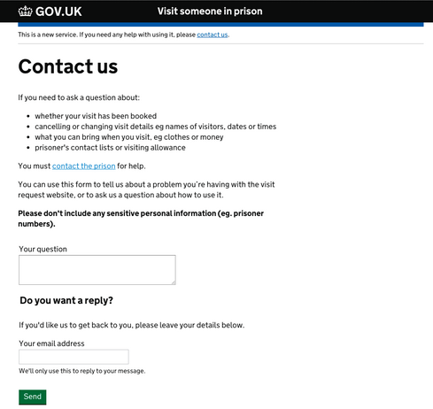
To understand what could be driving this misdirected stream of queries we thought we’d take a fresh look at our ‘contact us’ page:

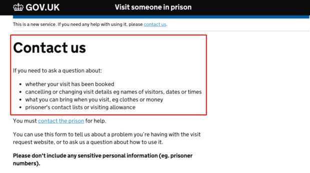
We realised that the copy on the page could be inadvertently encouraging users to submit non-technical queries to us - especially if they didn’t read to the end of the page.
We thought we could avoid these misdirected queries with clearer text.
We set out to find out by setting up an A/B experiment using Google Analytics.
For the uninitiated, A/B testing (sometimes called split testing) is comparing 2 versions of a web page to see which one performs better.
Version A (original)

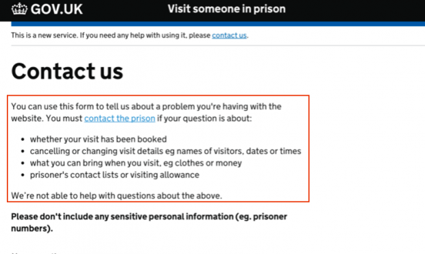
Version B (new)

Setting up the experiment
First we revised the copy to place more emphasis on what not to put on the query form, and referred to contacting the prison earlier on. We then needed to set up the mechanism of the experiment.
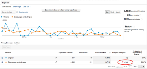
If you look under the ‘behaviour’ tab in Google Analytics, you’ll find a section called ‘experiment’. Once you have the 2 versions of the page you want to test, your team’s developer can help you set it up. What you’ll need to do is pick the aspect you want to measure as your success criterion, called a ‘goal’. In our case, the goal was to reduce ‘conversions’ or submission clicks on the contact us page.
Google Analytics then performs some magic involving a methodology called a ‘multi-armed bandit’ approach, which serves different variants while also attempting to optimise your page while it’s live. Within 2 weeks we had our results.
The results
Lo and behold, the new version of the contact us page led to an impressive one third decrease in people getting in touch with our contact centre. This should translate to both savings in terms of work hours and fewer frustrated users getting the run-around.

What’s better is that we can run more A/B or multivariate tests to refine the page even further. Do you have any ideas on how to improve the copy even more? We can put it to the test!
Feel free to contact me (nicole.kobilansky@digital.justice.co.uk), our copywriter Leigh (leigh.money@digital.justice.gov.uk) or our developer Jan (jan.szumiec@digital.justice.gov.uk) with any questions or comments.
To keep up to date with the other projects we're working on at MOJ Digital, follow us on Twitter.

2 comments
Comment by Andrew Robertson posted on
Have you considered having tick box type questions, so the comments box only appears in certain cases? eg
Do you want help with:
[ ] confirmation of an appointment, changing an appointment, etc > ask which prison after user ticks > provide specific contact details
[ ] using this website > contact form appears when this option is checked.
Does the user get an email once the request is made online? Does that say to contact the prison direct (and provide their specific contact details) if there are any changes needed to the booking or they've not had the booking confirmed by the prison? Are indicative timescales included on the confirmation screen and/or email eg 'allow up to x working days'? Those might avoid people coming to the contact form in the first place?
Comment by Nicole Kobilansky posted on
Those are all excellent ideas Andrew, thanks for your input. The tick box solution sounds great. We will monitor how much impact the current change has had, and if more nudging is needed, we will iterate iterate iterate!