We recently developed a date selector for mobile devices for the prison visit booking service, to allow users to quickly and easily choose dates when they want to visit a friend or relative in prison.
Around 40% of booking requests are made from mobile devices, so we made sure this was usable on a small touch screen.
Visits can be booked within the next 28 days. For large screen sizes (over 640 pixels wide) we created a conventional calendar style, 7 day grid. For mobile we wanted to provide larger touch points and retain the sequential dates whilst using as little vertical space as possible.
One place I'd seen something like this was the sliding dates on the Fantastical app for the iPhone.
Eddie our designer, came up with a simple design, but challenging to implement in HTML.
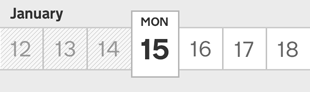
The 'date slider' can be used in two ways:
- slide the row to place a single day into the selected (centre) position
- tap on any visible day to make is slide into the selected position
The biggest challenge was making the text magnify as it slides past the centre frame. Here's how the effect is achieved using only CSS and a little JavaScript.
Creating the effect
The list is displayed as a table, and each day is a table-cell. This keeps a strict horizontal layout. Days have a 2 pixel border, which is achieved by applying 1 pixel side borders to each, and as they are butted against each other it appears as 2 pixels. The top and bottom borders come from the wrapping div element.
We wanted this component to be reusable, which is a great use case for OOCSS/BEM style class names. I've opted to use the SUIT style naming convention.
<div class="DateSlider-smallDates">
  <ol class="DateSlider-days">
    <li>24<li>
    <li>25</li>
    <li>26</li>
    <li>27</li>
    <li>28</li>
    ...
  </ol>
</div>
The next step was to make this list scroll horizontally. A simple { overflow:scroll } and a smaller width than the combined list items does this.
One way to create the magnifying effect would be to increase the font size as the day gets closer to the centre. But that would be a gradual increase, like the magnification of the dock on OSX.
Instead, a second row of days was added with a larger font size. These boxes are 150 pixels high to accommodate the abbreviated weekday label. The idea is to keep the scrolling of both rows in sync, and mask the large days.
<div class="DateSlider-largeDates">
  <ol class="DateSlider-days">
    <li><small>Fri</small>24<li>
    <li><small>Sat</small>25</li>
    <li><small>Sun</small>26</li>
    <li><small>Mon</small>27</li>
    <li><small>Tue</small>28</li>
    ...
  </ol>
</div>
$('.DateSlider-largeDates, .DateSlider-smallDates').on('scroll', function() {
  $(this).siblings().scrollLeft( $(this).scrollLeft() )
})
To mask the large days the containers width is simply changed to 100 pixels.
.DateSlider-largeDates { width: 100px; }
You'll find that you can scroll to the end of the small days, but the large days are only at "31" and the large days can be scrolled further. The date slider is 7 days wide and the large day should only appear once in the centre. To make this work, the first and last 3 "buffer" days are removed.
Then by correctly positioning the large days in the centre and style the buffer days we get this…
A "frame" was added as an extra element so it's border didn't interfere with the size of the large days.
Touch layer
But, there was a problem. When testing on my iPhone it seemed that scrolling on the large days confused the scroll offset of the small days. This led to a big change; the additional touch layer.
The touch layer is the same dimensions as the small days, but without the list items. Now there is only a listener for scroll events on the touch layer, which updates the small and large days.
$('.DateSlider-touch').on('scroll', function() {
  $(this).siblings('.scroll').scrollLeft( $(this).scrollLeft() )
})
There was intention to use a click event on the day elements, and scroll them to the centre. But the touch layer prevented this. Now the position of the day has to be calculated using the `event.offsetX` property.
var widthOfDay = 100
var daysToDisplay = 7
var centre = Math.floor( daysToDisplay / 2 ) * widthOfDay // 300

var slide = function(pos) {
  $('.DateSlider-large, .DateSlider-small, .DateSlider-touch').animate({ scrollLeft: pos }, 250 )
}

$('.DateSlider-touch').on('click', function(event) {
  slide( Math.floor(event.offsetX / widthOfDay) * widthOfDay - centre )
})
When the day has arrived at the centre position, and therefore selected, the slider outputs a `data-date` attribute on the day.
var large = $('.DateSlider-large')

var slide = function() {
  $(...).animate({ scrollLeft: pos }, 250 ).promise().done(function(
    selectDateFromIndex( large.scrollLeft() / widthOfDay )
  ))
}

var selectDateFromIndex = function(index) {
  return large.find('li').eq(index).data('date')
}

selectDateFromIndex(large.scrollLeft() / widthOfDay)

// outputs "2014-01-24"
An easily overlooked aspect, was what happens when the slider is not exactly placed upon a day box, which is pretty much 99% of the time. To handle this, at 300 milliseconds after scrolling the left offset is checked for whether it is less or more than half the width of a day box. The slider then moves to the closest day.
var centreDateWhenInactive = function(obj) {

  clearTimeout( $.data(obj, 'scrollTimer') )

  $.data(obj, 'scrollTimer', setTimeout(function() {
    slide( posOfNearestDateTo( large.scrollLeft() ) )
  }, 300))

}

var posOfNearestDateTo = function(x) {

  var balance = x % widthOfDay

  if (balance > widthOfDay / 2) {
    return x - balance + widthOfDay
  } else {
    return x - balance
  }

}

large.on('scroll', function() {
  centreDateWhenInactive( $(this) )
})
Scaling and design
The final step was scaling the whole slider. We wanted the date slider to be as large as possible and fill the width of the device. This was a good point to match the style to the the design. As the boxes were 100 x 100, the dimensions could easily be turned into percentages.
var squashDays = 0.95     // height is 95% of the box width
var magnifyDay = 1.4      // large day boxes are 140% larger than small
var upness = 0.22         // move the magnified frame up by 22%
var fontSizeScale = 0.52  // the small text is 52% of the box height
var magnifyFont = 1.33    // the large text is 133% larger than small
var shrinkWeekday = 0.42  // weekday text is 42% of the large text
var borderWidth = 2       // border width in pixels
When the slider first loads (and when the browser is resized) the view port is measured and divided by the display days (7) and then scaled by these factors.
Open the final version and change the size of your browser to see it in action.
Enhancements
Unfortunately the source code for this is not currently public. But I'm working on extracting this into a reusable component, which will eventually be available in a MOJ Github repository.
An enhancement to automatically build the small day list is currently in progress. This means only a single list has to be written in the mark-up.
Some other improvements to do are:
- use a touch library to add swipe momentum
- option to fit to containing element, rather than window
- (bug) remove remainder of width/days
- output the CSS to a style tag, rather than elements
I'd love to hear your feedback and I'd be very interested to know if anyone knows of another method for creating the magnification effect.

1 comment
Comment by picpool posted on
Congratulations, this is fanstastical !
It woul be ever more it could be possible to navigate through months...