Since February this year, the Content Hub team has been working feverishly to give people in prison improved access to their personal information, and now it's alive and kicking, we want to tell you about it.
If you haven't heard of our service before, the Content Hub is an online platform accessed via in-cell laptops, designed to support people in custody and free up staff time. We’re currently live in 9 prisons (male and female) and YOIs now and in the process of rolling out to many more.
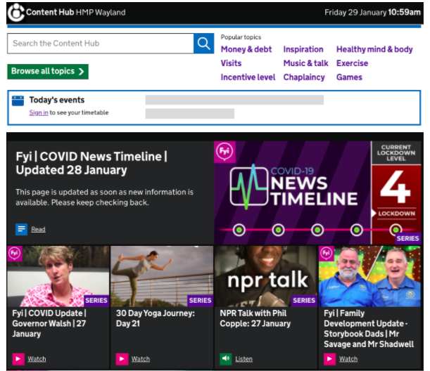
We’ve been showing people living in prison some of their personal information on the Hub, including their prison account balances, since Summer 2020. However, we found that account balances alone were not sufficient to meet user needs. Users regularly wanted to check specific transactions, including their pay for work, and money transfers from friends and family.
Overburdened wing officers were spending a lot of their time finding this information out and providing paper printouts. Not only was this an insecure way to provide people living in prison with their financial information, but they often had to pay for the paper copy. Given the amount of work already resting on wing officers’ shoulders, it would take time for them to print and deliver a copy, which would mean that the information was often out of date as soon as it was received. So, the Content Hub assembled a mini 'feature development team', and we started working on how we could show users their transaction history.
The problem with money
One of our central design principles on the Hub team is empowerment. For most people, prison results in huge changes, not least the feeling that you're no longer in charge of your day-to-day life. You lose agency.
Your days are mapped out for you, you are told where to go and when. There’s often very little choice but to repeatedly ask staff for answers on what are often simple questions such as “What is my current account balance?”, “Have I been paid this week?” and “How do I get a job in this prison?”.
We also know money is very emotive. Money affords one of the only crucial elements of choice in prison. And it is not difficult to imagine why. Having choice over what you eat, wear and buy are crucial to a person’s sense of self. However, we also know that many people in prison struggle with money management. In our research on the women’s prison estate this year, one participant said:
“Outside I can’t keep my appointments, I’m not good with money. I need help with all that. I’m good at spending money in prison... But in here I feel like I am mothered and fathered.”
Keeping an eye on your finances might also be problematic if you cannot readily access them. Here, in this quote, a user illustrates the problem with the traditional model of submitting a paper application, or “an app”:
“You never know what’s going on. Like a doctor’s appointment - as you don’t get the slip back half the time to tell you when to go. I’m quite organised and I don’t like things put on me... It makes you feel less like a chess piece being shifted around. I have a lot of trouble with wages, it’s difficult to keep track of what I’m being paid. Last week it was wrong, and the week before that. When I get the canteen sheet I’m expecting more, but a few pounds in here is a lot. I can fill in an app to finance but it takes a few weeks. It’s happening quite often. I ain’t got no private cash or savings.”
On top of the inefficiencies of submitting an app, there’s also the cost. These sums may not seem like much on the outside, but given the relatively low pay rate for some prison jobs (for example, the rate of pay for prisoners on long-term sick or of retirement age is £3.25 per week) this could add up, especially if your pay is consistently wrong. The other problem with printouts is the sensitivity of this information. If you lose the slip of paper with your finances on it, everyone knows how much money you do (or don’t) have, which, in prison, can result in issues such as bullying.
Getting to work
Another digital team within MoJ had already developed a staff-facing view of transactions. We decided to use some of this data and their designs as a starting point. Working with Olivia Todd, our Senior Interaction Designer, we chunked the work into discrete pieces of functionality. We started by showing users their account transactions for the past 30 days.
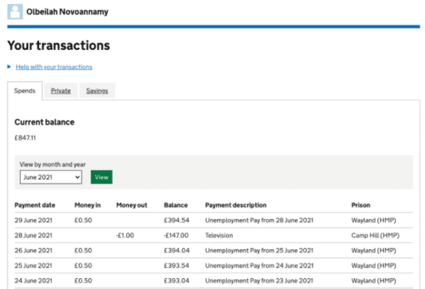
The first release showed users:
- their current balances for all their accounts (spends, private, savings)
- the payment date and description
- all money in and money out
- the prison this money relates to
In small increments, we then:
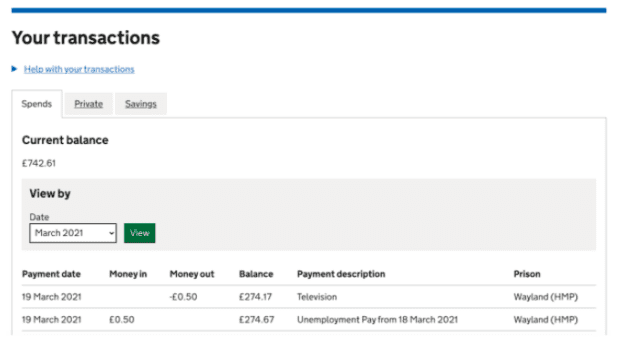
- added the last 12 months of transaction history data
- introduced a view filter, so users could select month and year
- added a new tab for “damage obligations” for those who had them
- added pending payments which conditionally revealed for those who had them
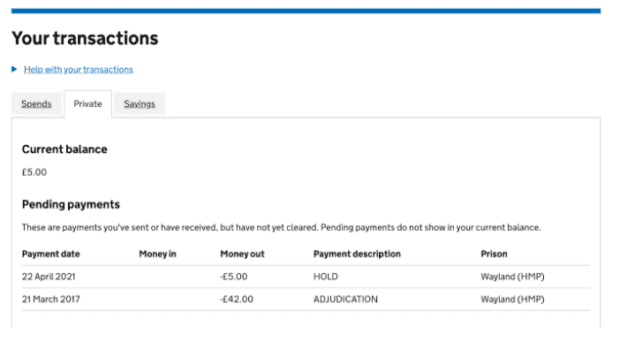
We also included a help details component linking to a supporting article that explained every field in more detail. We did this on the premise that anyone can go to prison. This means our users might sit anywhere on a spectrum of tech-literacy levels; ranging from zero knowledge of online banking apps and/or not keen on managing finances online, to people who were previously super-tech-savvy users of private banking apps in the past, and probably everything in-between those two extremes.
At times it felt like we were building an online banking miniverse for people in prison. We looked a lot at our own private banking apps for inspiration to see how major banks were displaying financial information in a user-friendly way.
Some of the design questions we pondered included:
- Is it more reassuring to see a section for pending payments (with an empty table) when you don’t currently have any pending payments? Or should we just hide this section altogether? Which option would increase questions for already-time-poor wing staff?
- Should we show damage obligations to everyone, or just to those that have them? What is more (or less) reassuring for users? Would users without any outstanding obligations know what they are? For reference, damage obligations refer to payments that prisoners must make for damage that they have intentionally caused to prison property.
- How far back in a transaction history do users need to be able to see?
We used tabs to allow users to toggle between transaction histories for each of their accounts. We decided to only show a section for pending payments and damage obligations to users that had them.
Navigation, navigation, navigation!
To get value to users quickly, we decided to link to the new transactions pages from our existing Money and debt page. We were already showing users their account balances on this page. We released this first so we could gather user feedback whilst working on a better navigation journey. We began by adding a new “View your transactions” link which, when clicked, took users to their transactions.
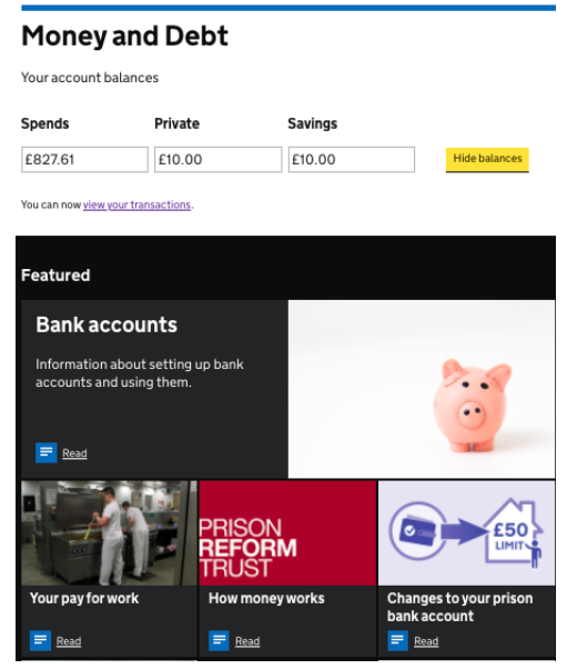
Not long after the first release, we received user feedback through our in-page feedback function that said:
“Like this format! Getting to this screen is not the clearest process though - just having a blue text link on the money page is a bit subtle. Missed it at first. Thanks”
This validated our concerns, but more importantly, led to a whole new chunk of work around designing a profile page for people in prison. This profile would later come to encompass, not only financial information, but also a user’s next visit information, incentive level (IEP) information, and timetable, all in one place.
Knowledge is power?
There has been a smorgasbord of interesting design challenges during the transactions (and profile) work, but one of the most enduring challenges has been deciding what content to show and what to hide.
In prison, misinformation can be rife, and opportunities to directly access your own information can be limited. However, it’s also a difficult balancing act between “knowledge is power - give users everything and let them decide what they need” and a user being confused or overwhelmed.
We were also keenly aware that money and canteen can be a source of bullying and can create vulnerabilities for people in prison. Information can be (in the worst cases) weaponised. This is why users are required to sign in and cannot see any personal information without doing so. It’s also why on the first load of the Money and debt page (and later, on the profile page) a user’s account balances are hidden by default. They are only revealed when a user clicks on a tile to see their balance or on Open all balances.

Same policy, different processes
We’ve also had to mitigate against the fact that prisons have slightly different processes. This made it difficult for us to provide universal help text because what users really need is tailored advice on how to query information that doesn’t look right to them or how to complete a certain task in their prison.
We do not have the ability for users to query individual transactions within the service. So we had to be upfront that we couldn’t help users with transaction queries. We signposted them to where they could get help, which was by raising their issue with a wing officer or submitting an app. We also linked to our supporting article explaining the transactions fields in more detail.
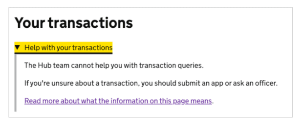
Our research from usability tests so far has shown that users are indifferent to generic help text. In our testing at HMP Wayland, some of our users missed the help section altogether. In HMP Lindholme, 2 out of 3 users located the help section but missed the text above the link and clicked straight on the article link.
We found that when users did read it, they found being referred back to wing officers frustrating or meaningless. For future iterations, we plan to rethink this component and in particular, the content within it. We plan to work more closely with local digital and comms managers on-site to help us write prison-specific help content.
Feedback so far
All in all, we’ve had some encouraging feedback. Here are some of our favourites:
- thank you for this information
- This is really helpful, thanks.
- WELL DONE GUYS AND LADIES.GOOD JOB.
- very good much more information about transactions.
- Thanks this looks really good.
- THIS IS A REALLY GOOD IDEA PUTTING ALL MY TRANSACTIONS ON THE HUB.GOOD WORK
- Excellent. Another good use of the digital platform making our lives much easier. Well done, Thank you.
- Very handy
- I think this transaction page is a real good idea as I feel its another good way of what money you have in your account
- This will be very help-full thanks 🙂
We’ll be blogging more about our adventures on the Hub, so keep your eyes peeled!
If your team or department wants to create content for the Hub, please get in touch with us at hubcontentteam@digital.justice.gov.uk .
