The Content Hub is basically a restricted and secure intranet created, designed, developed and written solely for the prison estate. It's the only 100% prisoner-facing service in MOJ Digital and Technology. In developing it, we've been constantly awake to the needs of these users and their highly-specific accessibility requirements.
As outlined in the Equality Impact Assessment for the In-Cell Technology (ICT) Programme, we're working to give adequate and appropriate user support so that no individual across the prison estate is discriminated against or disadvantaged by the introduction of the tech.
Communication in the prison estate is extremely important, as mentioned in our last blog. It can mean the difference between a calm landing and 'association' session, and a fight breaking out. If prisoners can't get the information they need, or can't get to use the kiosks to send apps or check their personal information, this leads to frustration, anger, sometimes aggression and even violence.
With the Content Hub, we have a great opportunity to create a new (hopefully, more efficient) way of communicating with prison prisoners.
Accessibility on the Hub is top of the list
Why? It's widely accepted that many people in prison have limited literacy skills, on top of concentration and neurodiversity issues, alongside their own individual long-term trauma, addiction and mental health problems. Our research has shown that 100% written communication and verbal instruction can easily go unread or unheard due to a cocktail of some, or all, of these factors. How then, do prisoners learn the rules, processes and what goes on in the place in which they live?
An end to the paper trail
All things have their place, of course, but in an increasingly information-heavy world, overloaded prison staff and traumatised prisoners (with literacy issues) communicating by paper notices under room doors does seem increasingly doomed to fail. Easy to say in hindsight.
But communication by paper now seems outdated to us all, as well as it being:
- expensive and time-consuming for staff (consider 'that temperamental printer')
- frustrating for both staff and prisoners when the comms doesn't get through or is lost ('but why aren't I getting my visit?')
- misunderstood or not understood by people in prison, due to poor literacy levels, mental health issues, problems with authority and other reasons too long to list here
- type-heavy 'induction' packs with rules and info about the prison are given to prisoners when they first arrive and they can be in turmoil, mentally, physically and emotionally
Misinformation on the landings
So if paper isn't getting through, what is? We found the communication of prison rules and procedures by word-of-mouth could be even worse. Staff might get exhausted with prisoners constantly asking the same things. prisoners might pass on incorrect information, genuinely and on purpose. A combination of many opposing 'truths' can leave a newcomer, already in crisis, reeling.
Communicating with people in prison - truth, trust, simplicity
The Content Hub team was very conscious of accessibility issues in adult pilot prisons HMP Wayland and HMP Berwyn. Using this research, we could build much more into the Young Offender Institutions (YOIs) research by Will and Iram as we planned the rollout into HMYOI Cookham Wood (boys aged 15-18).
As stated above, people need to trust the information given to them is the truth. When rumours and misinformation creeps in, reality becomes distorted and chaos resumes. But, even before that, the information has to be understood.
We tested and found highly visual information allowed inclusivity for foreign nationals, boys with reading difficulties, as well as people with visual impairments, for example, low or partially sighted vision. Graphics serve as visual cues working together with text. Similarly with audio, we found the boys were happy to listen to information, so long as it was in a voice they trusted (what we now call 'the authentic voice') and information was in simple language with no jargon or acronyms.
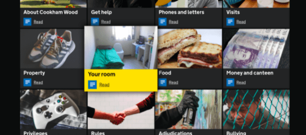
Bearing this in mind, we created a 'Guide to Cookham Wood'. This is a visual rulebook for staff and boys which includes everything they need to know about their time in Cookham Wood. Fundamentally, a digital version of the paper-heavy induction guide.
What we did to put accessibility first
Text and graphics
The default font size on the Content Hub is also slightly larger than the standard font sizes recommended in the GDS typography style guide. We did this because we know from research there's a disproportionate percentage of users with low literacy, numeracy and 'digital literacy' in the prison estate compared with an average sample from the public.
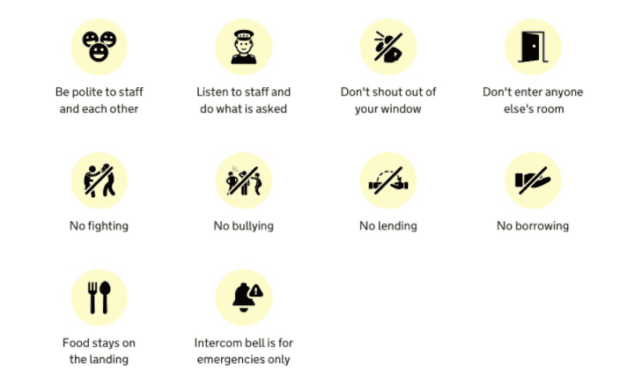
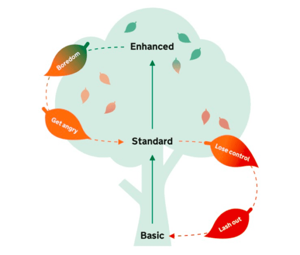
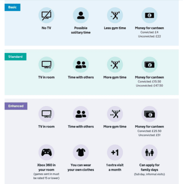
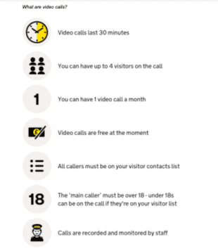
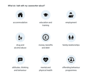
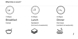
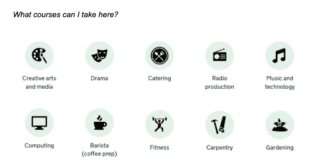
A picture is worth 1000 words. Nobody now knows this more than Senior Interaction Designer, Olivia Todd, who created from scratch a series of engaging, stimulating and brilliantly designed infographics.
She said: "One of the challenges of creating graphics was first to turn (what can be) complicated prison rules into simple language that we understood fully, before trying to visualise them. Infographics here are not just pretty pictures to break up a page of text - we want them to be fully-functional messages so that as many people in prisons can be as informed as possible."
Research in HMYOI Cookham Wood found that many of the 15-18-year-old boys didn't know the rules of where they were living, what they needed to do to get food or how to order from canteen. However well induction information is given, it can still not be 'heard'. And then we found some boys don't even make eye contact with another boy for weeks, never mind dare to ask them what time lunch might be.
So having everything the boys need to know about where they are on their laptops means they have a better chance of getting the information they need, at a time they feel able to process it. They can check information 24/7 so are less likely to pick up wrong information from the landings, lowering levels of stress, anxiety and aggression.
We provide 'alt text' so that it can be read aloud for people using screen readers. It can be beneficial for other users, if an image fails to render due to slow wifi/internet or maybe a bandwidth issue, for example.
These infographics speak for themselves:
How did the Guide test in Cookham Wood?
Very well. So well that we created a 'guide template' to pass on to the next prisons we're rolling out into, so Digital and Comms Managers can write (and keep updated) their own single source of truth about what goes on in that prison.
In our next blog, we talk about how we went further and used accessibility issues to focus on using the YOI boys to create their own audio content for the Hub.
If your team or department wants to create content for the Hub, please get in touch at hubcontentteam@digital.justice.gov.uk
