Back in May 2019, we started to migrate “prison finder” pages from justice.gov.uk to the GOV.UK website. Our main goal was to make sure the content really worked for our users while also moving us closer towards turning off an increasingly out-of-date platform.
Data, data and more data
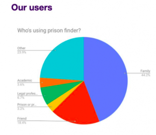
Like every good content design project, we started with data. Google Analytics showed that the prison pages were widely visited with over 250,000 unique visits each month. This was complemented by a discovery project and a user survey that highlighted:
- how the prison finder functionality was used (users could search by name, map or category)
- who the main users are
- what are their needs

Users first
This data provided us with a number of important insights:
- the main user group for the prison pages was family and friends of people in prison
- their most important goals were finding out how to visit their loved one and how to stay in touch
- they knew where their loved one was being held and would search for the relevant prison by name
- while the information on the pages were rated as ‘highly trusted’ sources, users had to dig deep to find the information that was relevant to them
These insights helped inform our goal of ‘moving and improving’ the content within the pages, rather than just migrating it. We were confident that we could extract all the useful elements of the existing pages, remove the little-read content that was cluttering the pages then focus on writing content that the user really needed.
Designing the content
One common comment from our user research was that information about each prison varied so widely. We wanted to give users a consistent experience so one of our first tasks was to look at the existing prison information on justice.gov.uk and identify commonalities.
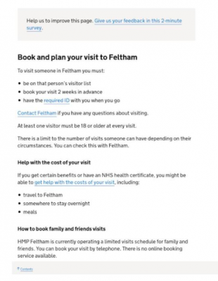
We used the data to help us make a decision about how we structured the content. For example, as visiting information and contact details were the most commonly read pieces of information, we made sure these were at the top of each page.
We wrote headings, ensuring they were clear and action focused so that users skimming through could navigate to the part they needed easily.
We also left out the things that had no clear user need, such as the history of the prison and administrative details like the prison category and acceptance criteria.
Iterating and testing
Having produced a small set of pages, we tested them with users.
We went into prisons to get some real life feedback from friends and family as they arrived to visit their loved ones. This gave us valuable user feedback and was also a good reminder that users didn’t just have practical needs (visiting times,), but also emotional ones (“I just want to know they’ll be OK”).
We also ran a survey on the new pages which indicated that around 70% of users were finding our new pages useful or ok. We were able to act on specific feedback that led to us adding jump links for easier navigation, introducing strong verbs to make section headings even clearer, and warning visitors that they may be sniffed by security dogs!
Looking beyond individual pages
We also took on the additional content challenge of integrating the new content with existing prison information on GOV.UK.
We talked to GDS about options for organising our new landing page. Although prison finder offered users the choice of searching by location or category, almost all users were simply using the list of names. As a result, we agreed on a collection page, ordered alphabetically and with jump links grouped by A to C, D to F to help users.
We also reviewed existing prison pages in GOV.UK and of the digital services for prison visitors. We are currently working with GDS to discuss how to implement the improvements we identified.
Maintaining prison pages on GOV.UK
Improving the content was just one part of the work we did. We also wanted to ensure it could be easily kept up to date by the eventual content owners, HMPPS Comms.
We set up a shared online workspace, regular meetings, and a working document of issues and decisions to discuss between us.
It soon became apparent that prisons were not always clear about how they could get pages updated. As a result, we took the opportunity to identify a single point of contact (SPOC) at each prison who would fact check our content and be able to contact HMPPS Comms with future amends.
As an additional way of ensuring pages are kept up to date, we also added a feedback survey to every page. This means that users and prisons easily get in touch if any of the information needs changing.
Finally, once all the new pages were live on GOV.UK, we ran a detailed handover session with HMPPS Comms. During this meeting we shared:
- our user needs
- a template for the pages
- a style guide covering terms in plain, empathetic English
- solutions to common challenges we had solved
- detailed explanation of our approach
- proposed management options

Visit the new prison pages
This work has offered an excellent opportunity to put content design principles into practice.
Using data to offer insights, identifying strong user needs, focusing on consistency then testing and iterating are all just as important as the actual writing element for content designers. In addition, we’ve looked at joining up the online journey for people visiting family or friends in prison and identified ways to keep the pages up to date - a task that is always complicated.
We will be taking this approach to the remaining areas of the Justice website as we move and improve the few remaining areas of content on it. In the meantime, you can see the new prison pages
Let us know your thoughts in the comments below or complete the survey you’ll find on each page.

4 comments
Comment by Alice Whitehead posted on
Great work, well done, love to read about sensible pieces of work with a big impact for users, like this.
Comment by Colin Meney posted on
Well done - it sounds like a rewarding piece of work that will have real impact for prisoners' friends and family.
Comment by Alex posted on
Excellent work. Can you explain how you use ’Empathetic English’ design in your process, please?
Comment by Mark Jefferson posted on
Hi Alex. Our discovery highlighted how worrying and confusing it can be for people when a loved one goes to prison. We therefore wanted our content to be practical and reassuring. We chose words that our users would understand and use themselves. We also focused on the experience of the user's loved one, rather than the systems and institutions of the justice system, which can sound cold and impersonal. For example, we use ‘rooms’ rather than ‘cells’, talk about 'life' in prison rather than the 'regime' and refer to the people in prison as men and women rather than offenders or prisoners, as much as possible.