Research found people in prison need easy access to their timetable, account balances, incentive level, and when their next visit is - this is how we fulfilled those needs and why.
The Content Hub is a platform available to people living in prison who have access to laptops in their cells or rooms. It is currently LIVE in 9 prison sites, including all Young Offender Institutions, and we are continuing the live rollouts.
The Content Hub provides in-room exercises, local prison news and information, mental health and addiction support, and distraction tools such as games and National Prison Radio shows. We exist to support people to progress and cope in custody, and to free up staff time.
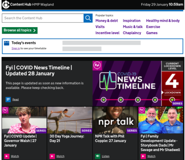
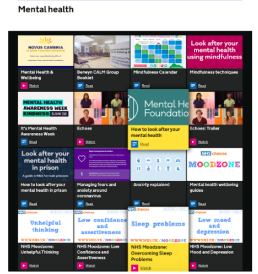
Our research on personal information
Last year we conducted some research with people living in prison to find out what personal information, held on HMPPS systems, they frequently need access to. We also wanted to find out what the benefits would be of displaying this data on the Content Hub. Not just for people living in prison but for staff too.
Our research told us that people living in prison frequently need to see:
- their daily and weekly prison timetable (showing them if they’re in education or work, for example, or if they have a healthcare appointment)
- their prison account balances
- what incentive level they’re on (their Incentives and Earned Privileges - IEP)
- when their next visit is, and who is coming
If we showed this, our research found that it would save staff time in undertaking burdensome administration and help people in prison to feel more self-sufficient and in control of their own information. It would mean that people would no longer miss important healthcare appointments or visits with loved ones simply because they missed the paper slip placed under their door telling them that they had one. And, it would mean they wouldn’t have to pay to receive a paper copy of their account balances or receive an out-of-date copy after having to wait for it to be printed and delivered (which may take days).
Creating an MVP
To create a minimum valuable product (MVP), we decided to add this information to existing content pages. People were able to view their personal information alongside helpful content about that topic. If, for example, they were looking for their savings account balance, they could view that alongside information about how to manage their finances, or find support for getting out of debt. This worked well, and meant that people were never left at a ‘dead end’; there was always a way to find more information or get help.
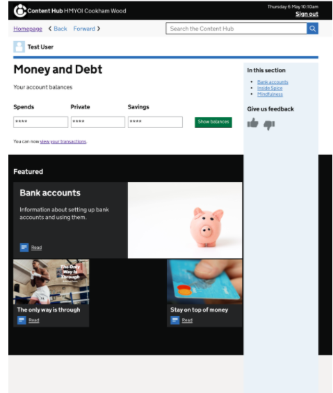
However, further usability testing told us that people would prefer to see all of their personal information in one place, instead of moving between different content pages. And that is how the idea of ‘Your profile’ appeared.
A profile is born
Guided by our research and armed with our early doors design work on personal information, we worked with our very talented Senior Interaction Designer Olivia Todd to design a brand new profile page. Using the NHS card component for inspiration, we chunked the page up into sections for timetable, incentive level information, money, and visits.
Attempting to assimilate all of this personal information, all of it competing to be 'top of page', posed some interesting decisions about the hierarchy of information.
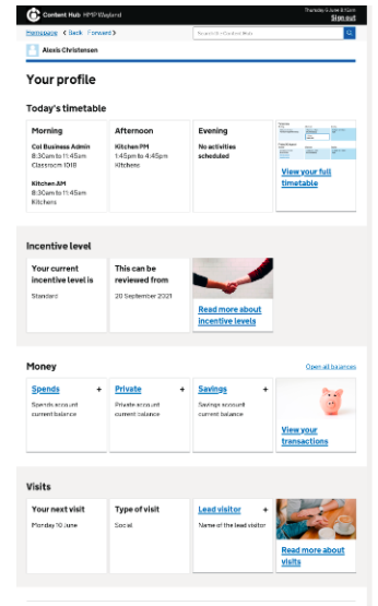
Initially, when we launched the profile, Visits was at the bottom. This felt appropriate because due to the coronavirus pandemic, in-person visits were suspended, so this was not a priority. However, this may change. Now users can see everyone who is coming to their next visit, how many visits they have left (including any privileged visits they may have), and a full list of their approved visitors.
In our original research for the MVP, analytics told us that Timetable was the most popular item, so that was kept at the top. We then showed Incentive level followed by Money (which showed top-level balances at a glance, with a link to a full transaction history). Giving users access to their transactions was a new feature and one we knew users needed given that it still costs to see your own account transactions in some prisons. You can read more about our work on giving people in prison access to their financial transactions.
We’ve had mixed feedback about the importance of incentive level (or “IEP”). Recently, at HMP New Hall, for example, we heard that if you’re already enhanced then it’s probably not as important to see your incentive level or review date. However, people on basic or standard incentive levels may be more interested to see this, as well as any “positive or negatives” they’ve had. By the same token, if you’re a “lifer” on a longer sentence and have cut ties with friends and family (which unfortunately can happen) visits may not be a priority for you when viewing your profile.
In short, it is difficult to make a one-size-fits-all approach when everyone is different. Eventually, we hope to make the profile modular and more customisable, so that users can choose what they want (and don’t want) to see.
Navigating to the profile
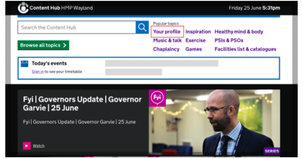
Once the profile was LIVE, we added a new link to it in our “Popular topics” homepage menu to make it easy to find.
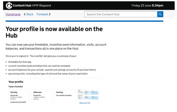
We also simultaneously released an article announcing it was LIVE with explainer content. This was put on the Content Hub homepage.
 Privacy-first
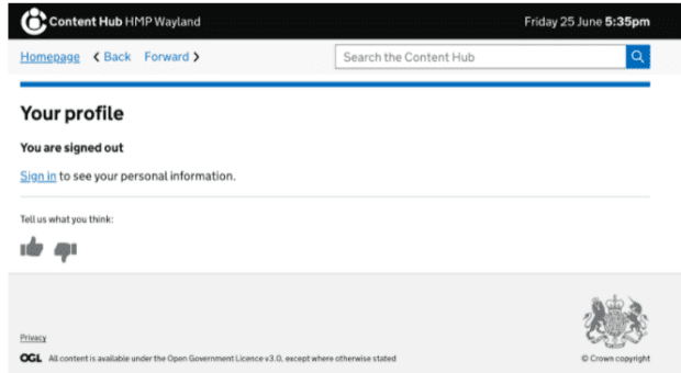
Users are required to sign in to their profile and cannot see any personal information without doing this. They can, however, still view general content, which makes viewing their personal information a considered choice.
Once signed in, users can see some of their personal information immediately but not all of it. Some prisons, especially women’s prisons, can be more open in setup or layout, with shared house blocks and communal areas. Because of this, we wanted to make sure sensitive information, such as account balances and the names of visitors, were hidden on the first load of the page with the use of accordions.
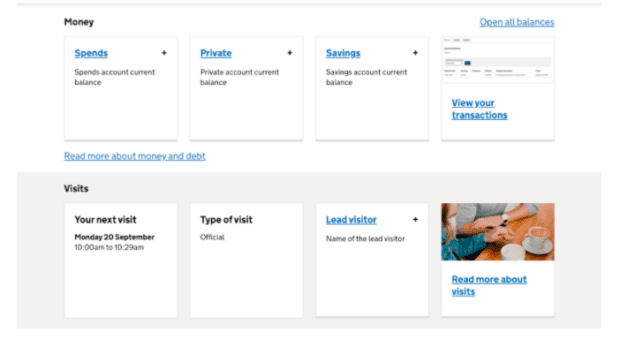
This way, a user will only see this sensitive information if they choose to click on that tile or “Open all” in that section.
What’s in a name?
Despite its seemingly outward 2-word simplicity, there was a surprising amount of consideration given to what the profile was going to be called on the front-end.
We had reservations that the word “profile” may conjure up images of a personal bio or social media type profile which is not how this page was going to function. Turns out, our assumptions were right! In some of our in-person usability testing, one user said they expected to be able to edit their profile when they saw the words Your profile on the Homepage. This was a concern. However, most users recognised that they could access their transactions (which was a task we set for them in testing) from their profile too. This is something we’re monitoring during analysis going forward.
As the content designer working on the profile, I also had a long deliberation over the pronoun. Should it be “My profile” or “Your profile”? This seems to be an age-old debate. I knew I wanted a possessive in there because I wanted users to know this was theirs, it was about them and for them. We also needed the pronoun in our navigation menu, to demarcate it from all our other general content pages that can be read by anyone and have no personal data in them.
We did a lot of desk-based research to see how private companies were doing this. We found a few monolith brands using “your” in their interfaces. For example, Spotify has settled (at the time of writing) on “Your library” in their interface. Finally, we went for 'My'. An example of the tiny, but important, daily decisions in the life of a content designer!
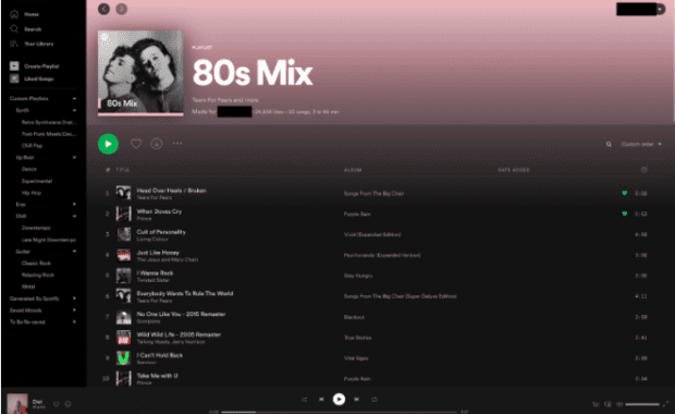
Currently, the profile is static and does not allow users to manage or control their personal information. Users can simply view it. In time, if the profile does become more transactional and allows users to manage or edit their info, or allows them to apply for other services from the Content Hub, we may revisit this.
Feedback so far…
The profile is still very much a work in progress. Users of this service can tell you more about what they think about the profile than we can. Here are some of their verbatim comments:
“This profile set up is a lot better and easier to read. Keep up the good work”
“Fantastic work, really simple and clearly laid out”
“Alot better profile easy to use thank you”
“This is really handy”
“Helps out”
“Very good way to find personal information without disturbing the officers.”
On a user research trip to HMP New Hall, we asked people what they made of our early designs of the profile. One participant said:
“With this they’d be doing it themselves rather than waiting on someone else. Everything is done for us - even our doors are unlocked for us. It’s having a bit of yourself back I guess.”
This for us - helping people in prison to feel empowered, giving them a sense of agency, and able to build skills to help them thrive outside - is why we do what we do.
If your team or department wants to create content for the Hub, please get in touch, please email us at hubcontentteam@digital.justice.gov.uk
1 comment
Comment by sadaqat posted on
I was woking on something similar to this was really helpful.
please visit us @<a href="https://sadaqatclinic.com/">best addiction treatment center in pakistan</a> Thank You